
Finding a look
Neutral grays so the interface never colors your photos, one blue accent, and an icon painted the way Seurat painted.
The last step before code was the visual design: colors, type, icons, and the app icon. The wireframes had settled where everything goes; this was about how it looks.
Gray, on purpose
Claude’s starting proposal, which I agreed with, was a quiet, neutral interface. The reason is specific to photo apps. If the interface around a photo is warm or cool, it changes how you perceive the photo’s colors, and you end up correcting for the interface instead of the picture. So Seura’s grays are exactly neutral, with no tint at all, in both light and dark mode.
Color in the interface is reserved for meaning. One accent, a deep blue, marks the main action, the current selection, and keyboard focus. Stars are amber; warnings are red. That’s it.
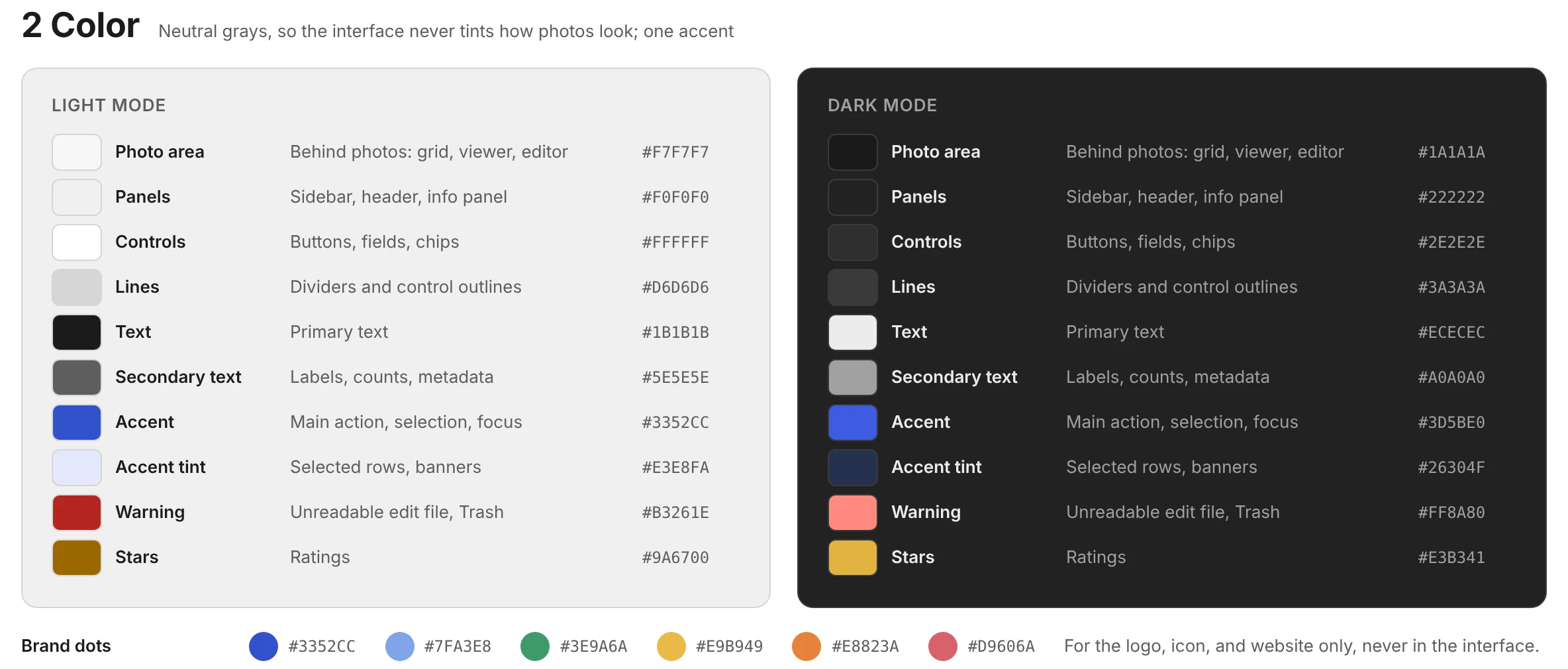
For type, the app uses each operating system’s own font: Segoe UI on Windows, San Francisco on the Mac. It looks native, stays crisp at any display scaling, and follows your text-size setting. The brand uses Figtree, an open-source typeface, which is what you’re reading in the headings here.
The icon
The personality lives in the icon, the logo, and this website. Claude drew three directions, all built from dots as a nod to Seurat:
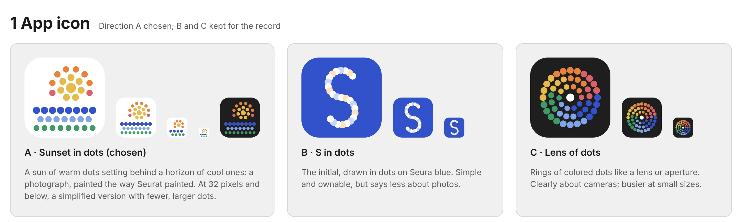
I chose A. It’s lovely. A sun of warm dots setting behind a horizon of cool ones: a photograph, painted the way Seurat painted. In refining it, we made a second, simpler version with fewer, larger dots for small sizes like the taskbar, where the full version turns to mush.
The screens, styled
With the colors and type chosen, the main screens were restyled from the plain wireframes. Each works in light and dark mode and follows the operating system’s setting.
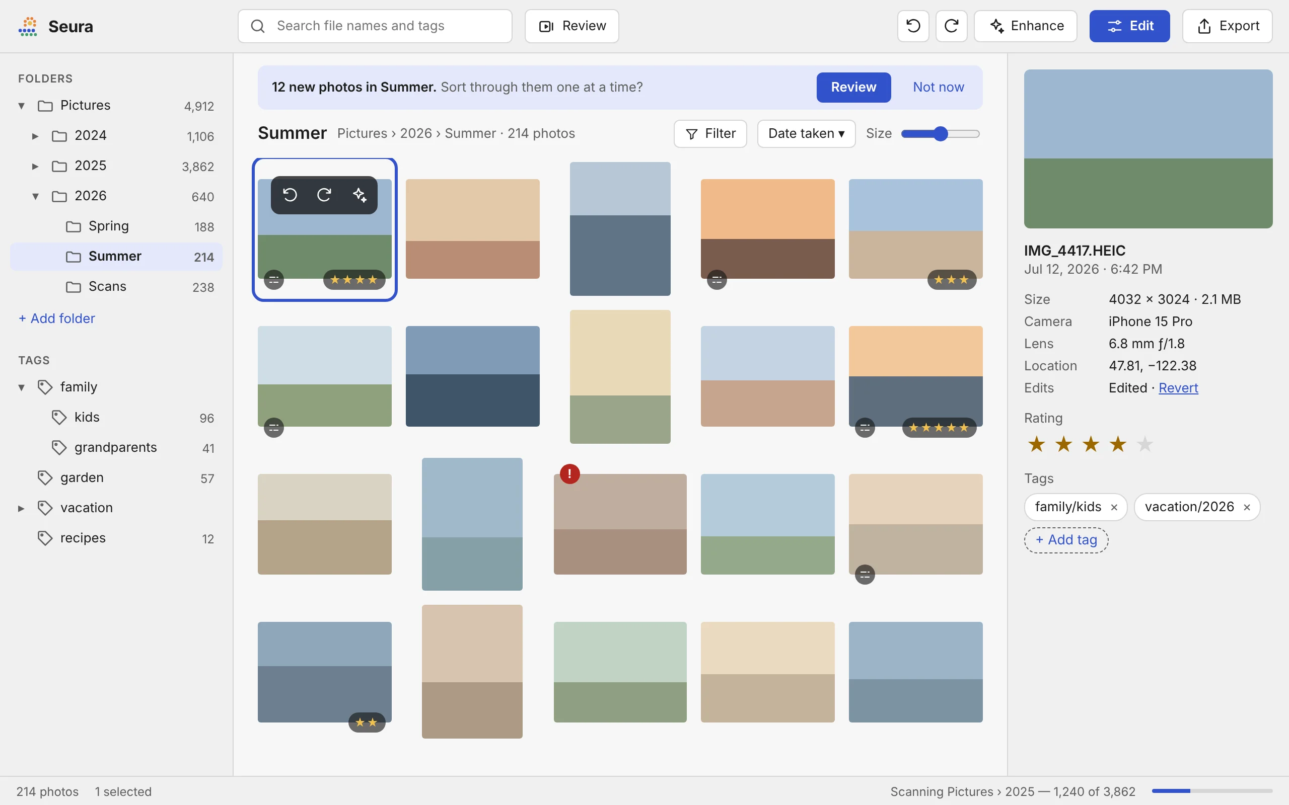
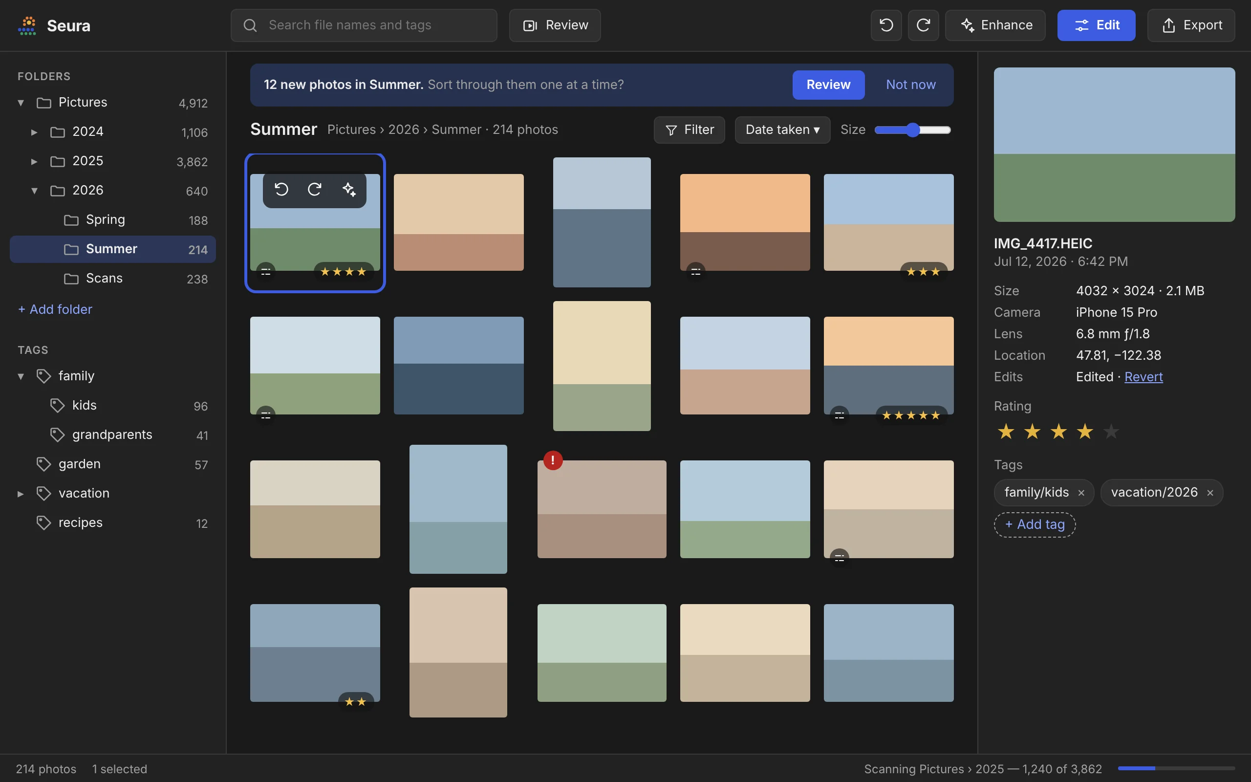
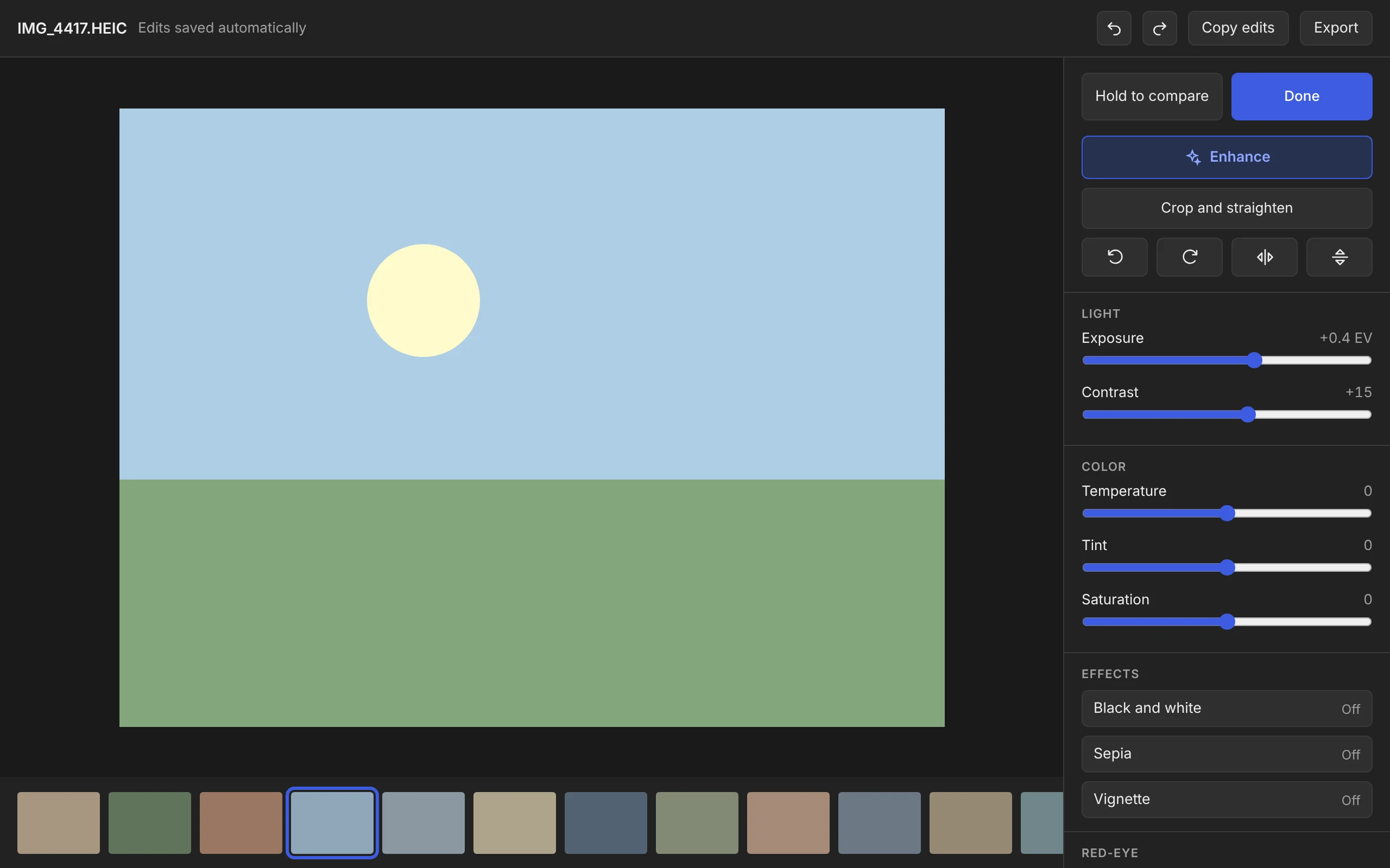
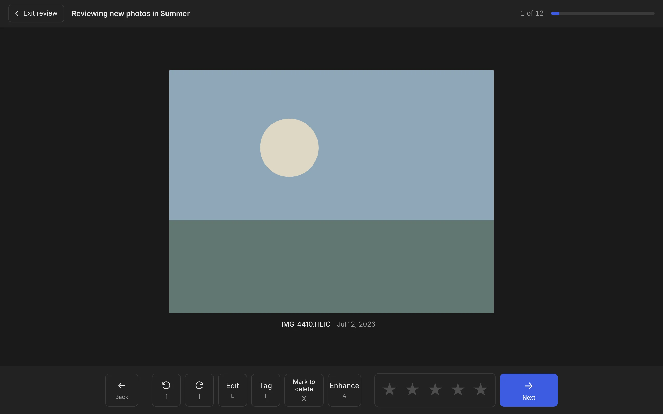
All of these values live in a single tokens file in the repository, which both the app and this website read. If I decide later that the blue is wrong, changing it is a one-line edit.
What’s next
That’s the design phase done: the brief, the spec, the format, the interface, the technical plan, the milestone plan, and the look. The next post will be about the first real code, the walking skeleton: getting a window open on both Windows and macOS, reading a folder of photos, decoding an iPhone photo correctly, and making one edit work end to end.