
An opinionated interface
My first idea was a wizard mode and an advanced mode. Instead, Seura has one layout, decided by the app, built around the order people actually work in.
Before drawing any screens, I wanted to settle how Seura should feel to use. My goals were clear: the fewest possible interactions, the most common actions quickest, and some sense of flow from one step to the next. My first idea for getting there was two modes: a guided, wizard-like mode for most people, and an advanced mode for everything else.
One way to use it
When we talked it through, Claude argued against modes. Every mode doubles what has to be designed, tested, and explained, and users end up wondering which mode they’re in. The alternative was to make the app itself opinionated: decide the best way to work and build only that.
That direction appealed to me immediately. The application should define how you use it. Rather than letting you hide and show panels or rearrange toolbars, everything is simply there, in a place chosen on purpose. It’s now a principle in the brief and a numbered requirement: one layout per screen, no customization, no beginner or advanced modes.
Built around the process
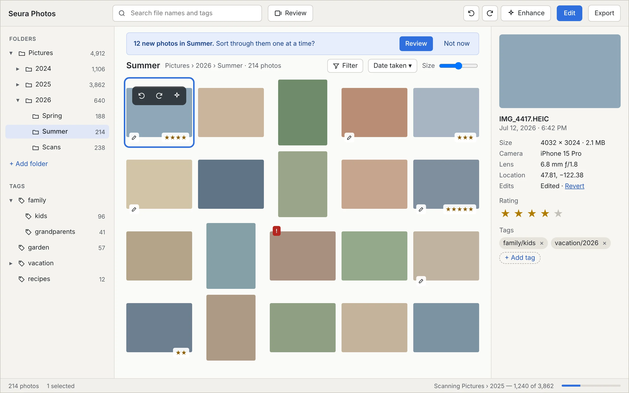
If the app decides the layout, it needs a basis for deciding. Ours is the order people actually work through their photos: find, sort, fix, organize, share. Tools appear in that order wherever there’s a sequence, including the editor’s tool panel: Enhance first, then crop, rotate, light, color, effects, red-eye, presets.
Every action is also assigned a tier by how often people need it. The most frequent ones (rotate, Enhance, rating) are always one click or one key away, even straight from the photo grid, without opening the editor.
A guided review
The wizard idea didn’t disappear; it became a single, focused screen. When Seura finds new photos, it offers to review them: one photo at a time, as large as the window allows, with a row of one-key actions underneath. Rate it, rotate it, enhance it, tag it, or mark it for deletion, then move on.
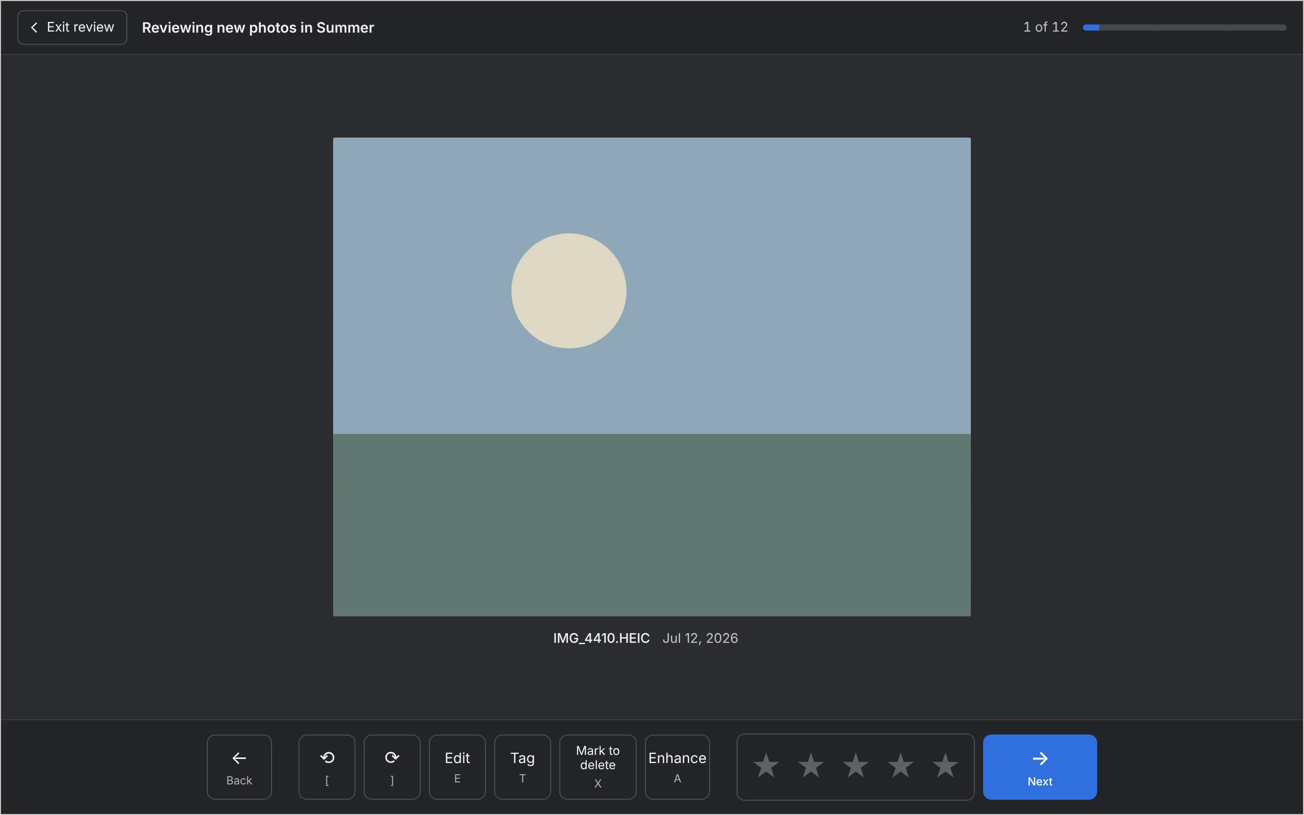
One detail that came from me: the button says “mark to delete,” not “delete.” Nothing is removed until you finish the review and confirm once, and even then it goes to the Trash or Recycle Bin. The wording has to make that obvious.
Keeping the pointer close
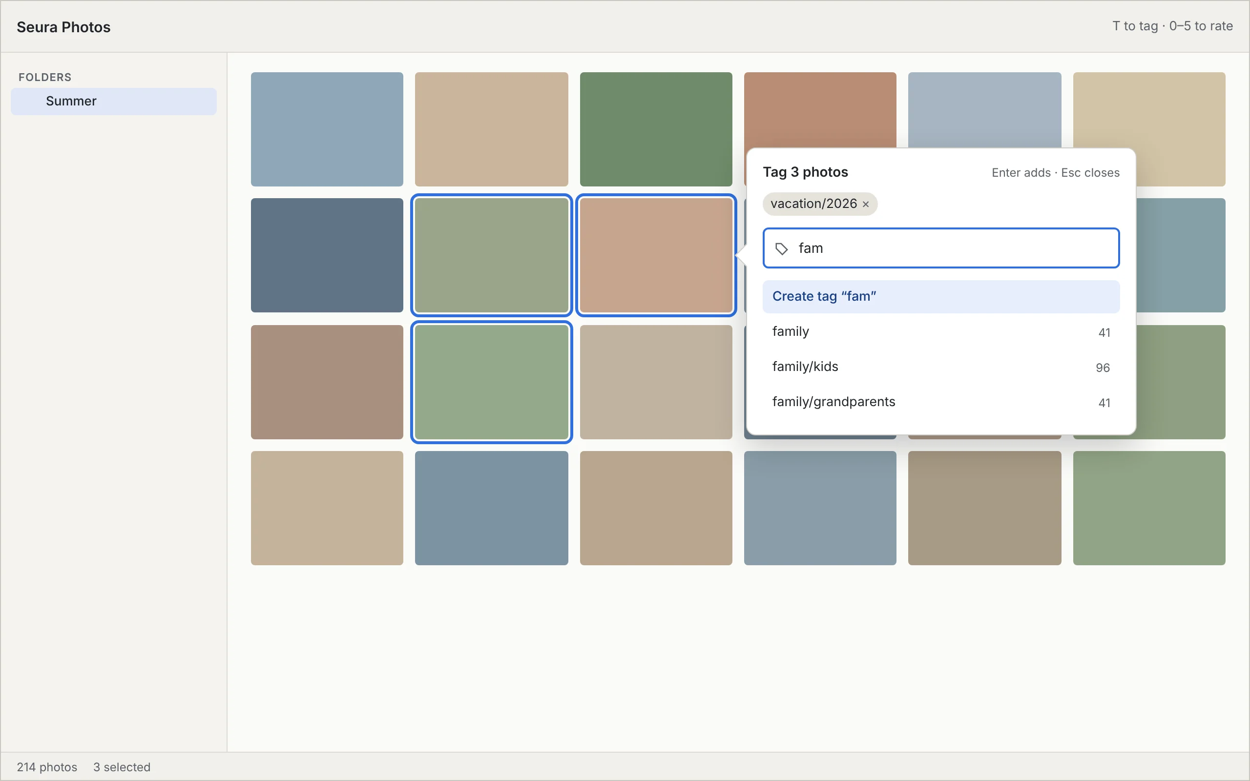
While looking at early layouts, I realized that the distance your mouse travels matters as much as the number of clicks. When a control appears, it should appear near where the pointer already is. There’s a name for this: Fitts’s law, which says the time to hit a target grows with its distance and shrinks with its size.
That became its own requirement. Controls revealed by an action appear next to the thing that revealed them. Frequent buttons are at least 32 pixels; a flow’s main button at least 44. And confirmations never put the destructive button where the pointer already is, so a double-click can’t delete anything.
Room for photos
My last input at this stage was about screens. Most people now have high-resolution displays, so there’s room to work with. The rule we wrote: the extra space goes to the photos (more columns, bigger thumbnails, a larger editing area), not to more controls. Every screen still has to work at 1280 by 720.
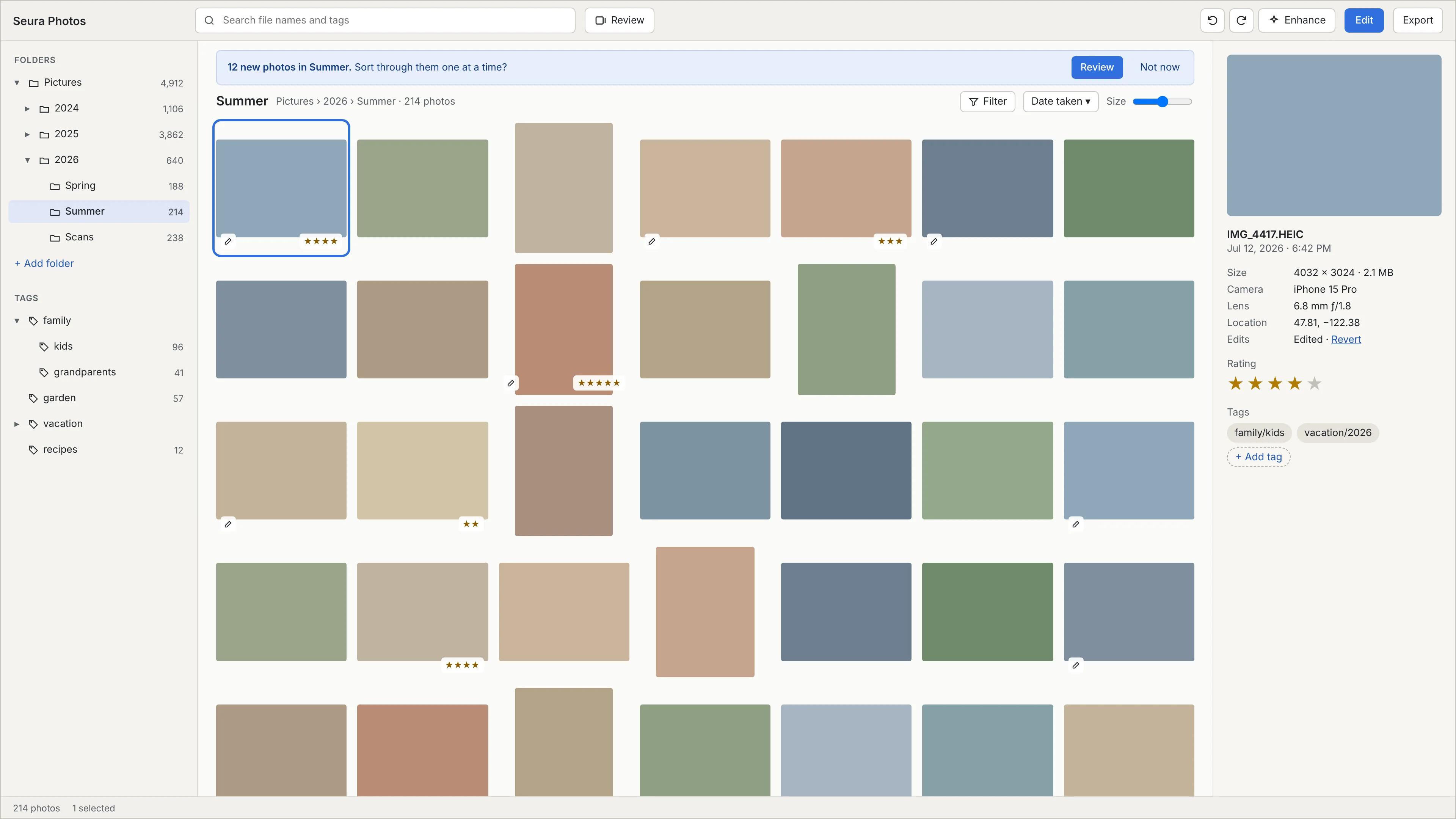
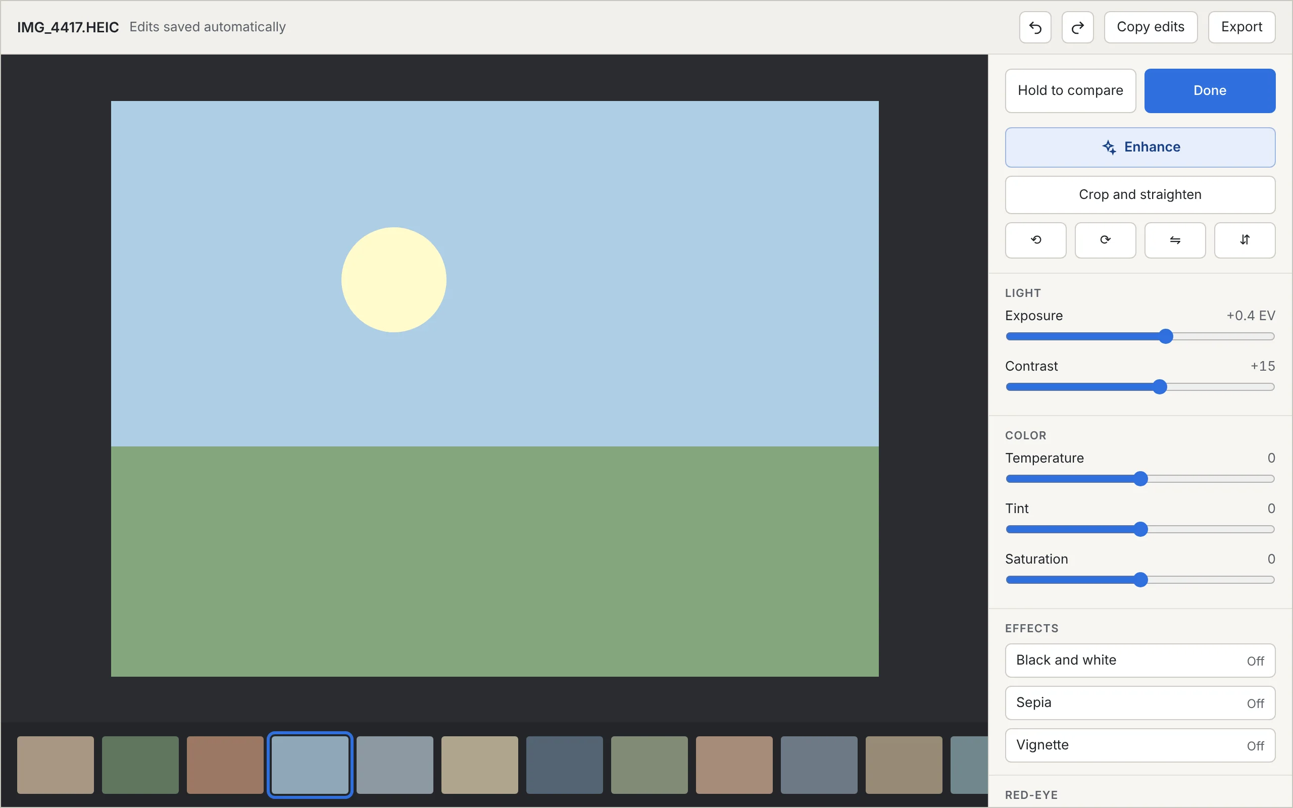
These wireframes were interactive: you could click through from the Library to Review to the Editor and try the sliders. They were deliberately plain. How it should actually look came later.
Next: the technical plan.